Fraser Coast Tint
- Wireframe Design
- Detail System
- Pixel perfect
- Figma Auto-layout
Fraser Coast Tint, a leading Queensland tinting service, sought to revamp its outdated website. We transformed it into a modern, responsive platform, enhancing usability, design, and navigation to boost engagement, streamline conversions, and strengthen online presence and customer trust.
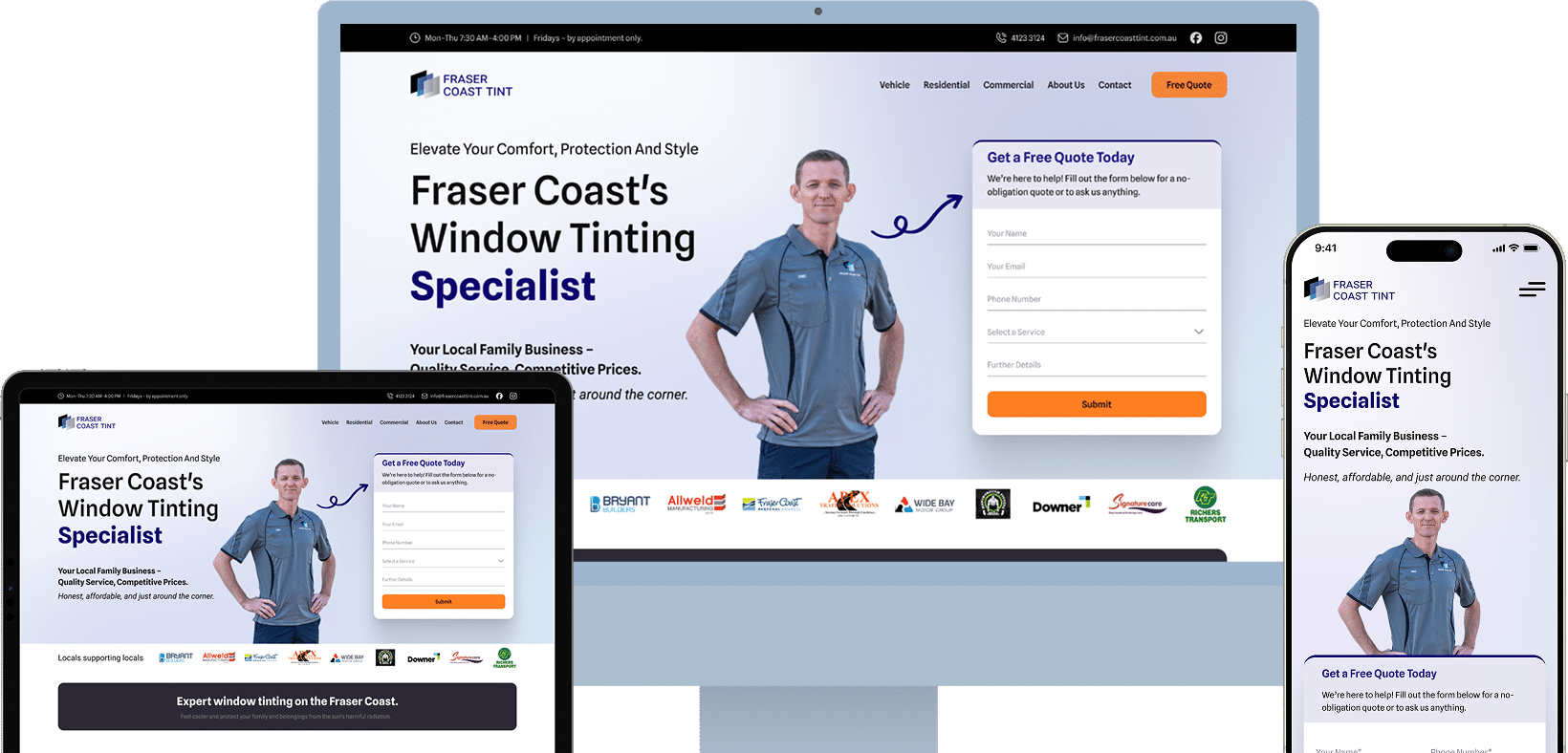
The main task was to redesign Fraser Coast Tint’s website for better usability and visual appeal. We delivered a responsive layout, simplified navigation, and clear service presentation to boost engagement, increase conversions, and ensure a seamless multi-device experience.
The style guide defines typography, colors, buttons, icons, and spacing to ensure brand consistency and usability. This uniformity enhances familiarity, accessibility, and professionalism while streamlining updates, creating a cohesive, seamless user experience across all digital platforms.
- Typography
- Colors
- Components
- Wireframe
- Mockups
- Prototype
We began with research and user analysis to identify challenges. User journeys and wireframes shaped the structure, refined through feedback and testing. High-fidelity prototypes focused on clarity and accessibility, with detailed specifications ensuring a smooth development
The original website’s outdated design, confusing navigation, and poor mobile responsiveness led to low user engagement and conversions. Our solution was a user-centered redesign featuring a clean, modern layout, streamlined navigation, and clear CTA. By improving visual hierarchy and ensuring seamless responsiveness across devices, we enhanced usability and transformed the site into a more effective tool that drives engagement and supports business growth.
- Outdated and non-responsive design that caused poor usability on mobile devices.
- Lack of clear communication around services, benefits, and value proposition.
- Missing visual hierarchy and inconsistent UI, making it hard for users to navigate or take action.
- No strong trust elements like reviews, warranties, or legal compliance content.
- Limited emphasis on local relevance and legal regulations around window tinting.
- Weak content structure with poor visibility of pricing, services, and user needs.


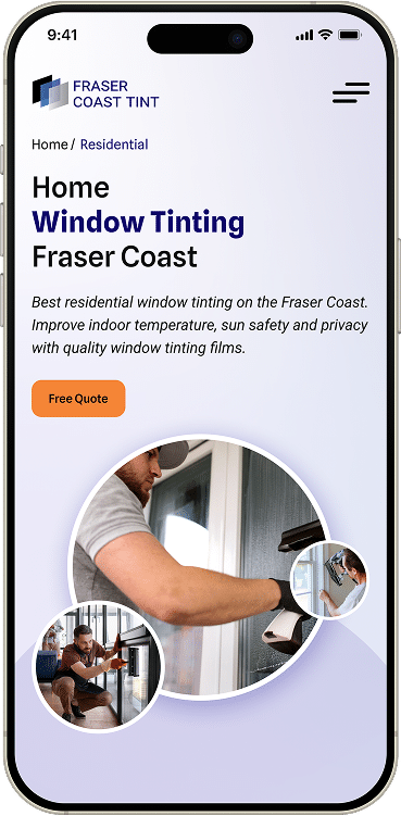
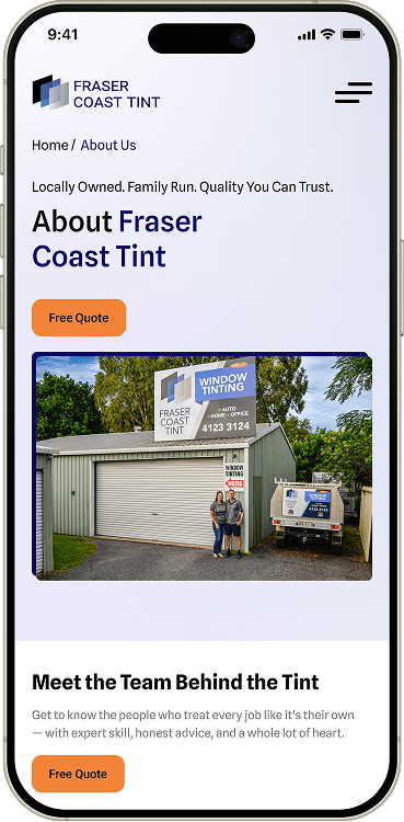
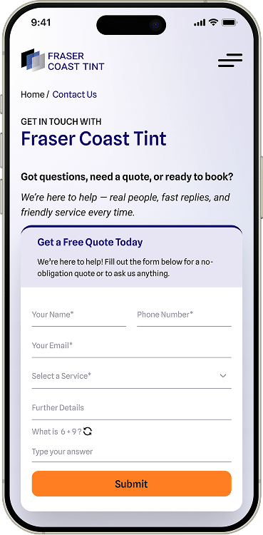
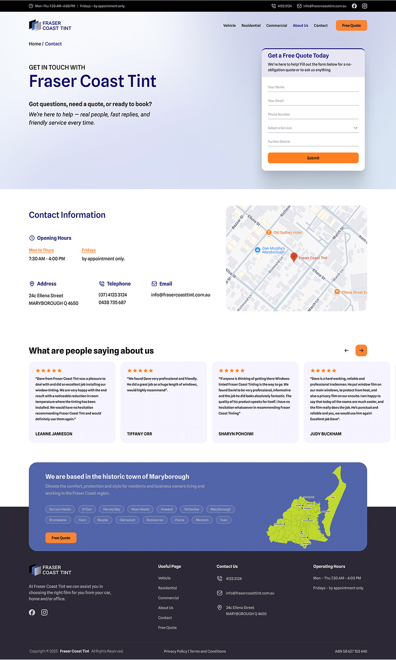
- Designed a fully responsive website for seamless experience across all devices.
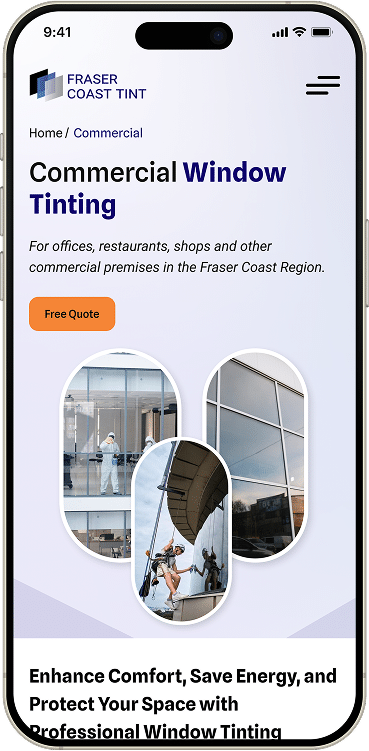
- Simplified service structure with dedicated sections for each offering and its benefits.
- Applied strong visual hierarchy, consistent UI elements, and clear CTAs to guide user flow.
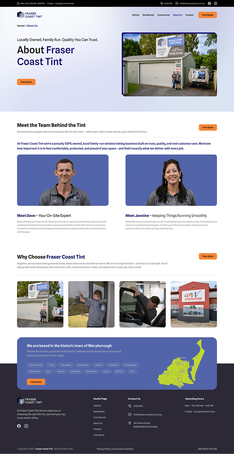
- Added trust signals including 5-star reviews, lifetime warranty info, and compliance FAQs.
- Highlighted local relevance with targeted content for Fraser Coast areas.
- Applied UX writing to improve clarity, accessibility, and user engagement.
Fraser Coast Tint’s website transformed from a dated, static layout to a polished, responsive platform. Improved navigation, mobile usability, and visual hierarchy enhanced usability, boosted engagement, increased conversions, and strengthened brand credibility, making it a valuable digital asset for the business.
Our primary goal was to transform Fraser Coast Tint’s website into a modern, user-friendly platform that drives engagement and conversions. Objectives included improving usability, creating a responsive design, simplifying navigation, enhancing visual appeal, and clearly showcasing services ensuring a seamless experience that builds trust and supports business growth.
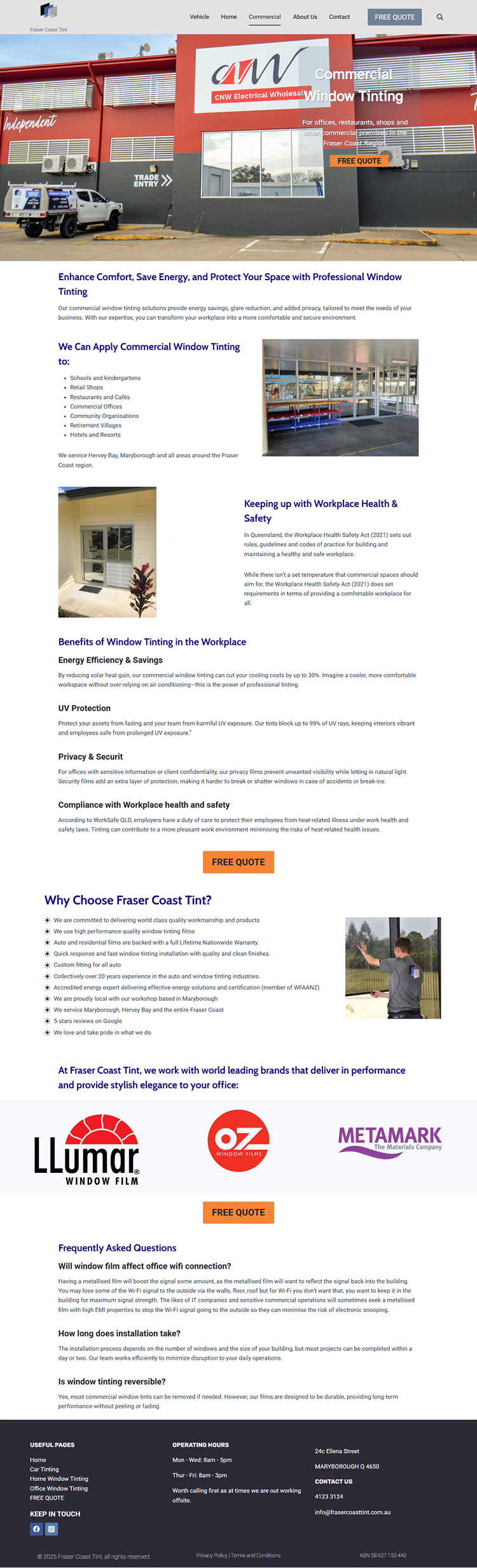
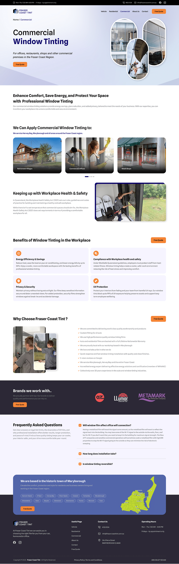
This comparison highlights the critical differences between the old and redesigned Fraser Coast Tint website. From a dated, cluttered interface to a clean, modern design with intuitive navigation, faster performance, and well-structured service pages, the improvements enhance user experience, boost engagement, and align the site with the brand’s quality.
| Key Points | Old Website | New Website |
|---|---|---|
| UI Design | Outdated interface with no unique branding or visual consistency | Custom, modern design aligned with brand identity and professional aesthetics |
| User Experience Flow | Cluttered layout, unclear navigation, and no defined path for user interaction | Simplified layout with intuitive flow guiding users to explore and take action |
| Mobile Responsiveness | Unoptimized mobile experience with slow loading and distorted layout | Fully responsive, fast-loading design with smooth performance across all devices |
| Visual Hierarchy | CTAs were hard to find and layout lacked proper structure or emphasis | Clear visual flow with well-placed CTAs and balanced layout design |
| Moules | Missing dedicated pages for key services like Residential and Commercial Tinting | Complete structure with separate pages for each major tinting service offered |