TradeRun
- Wireframe Design
- Design System
- Pixel perfect
- Figma Auto-layout
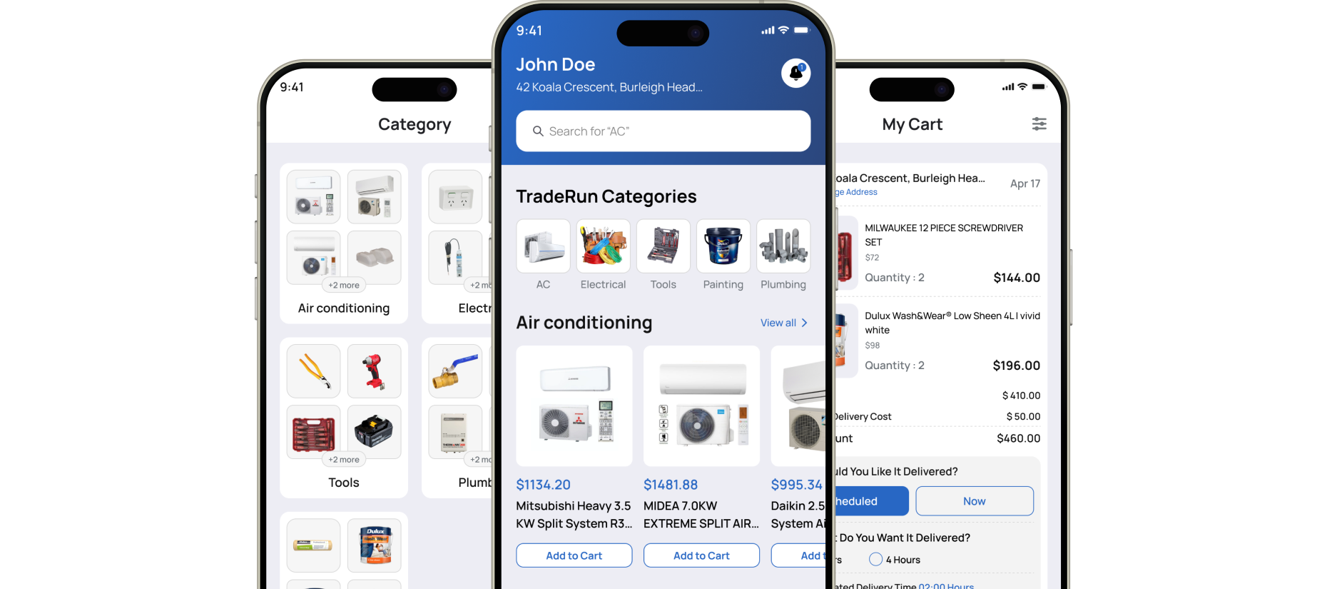
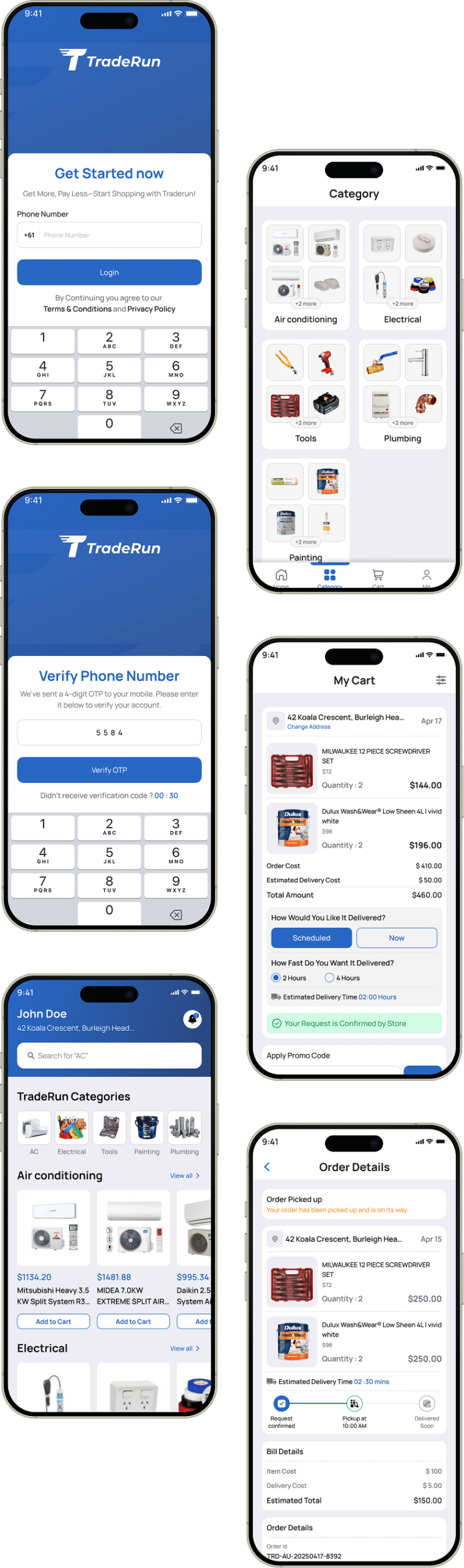
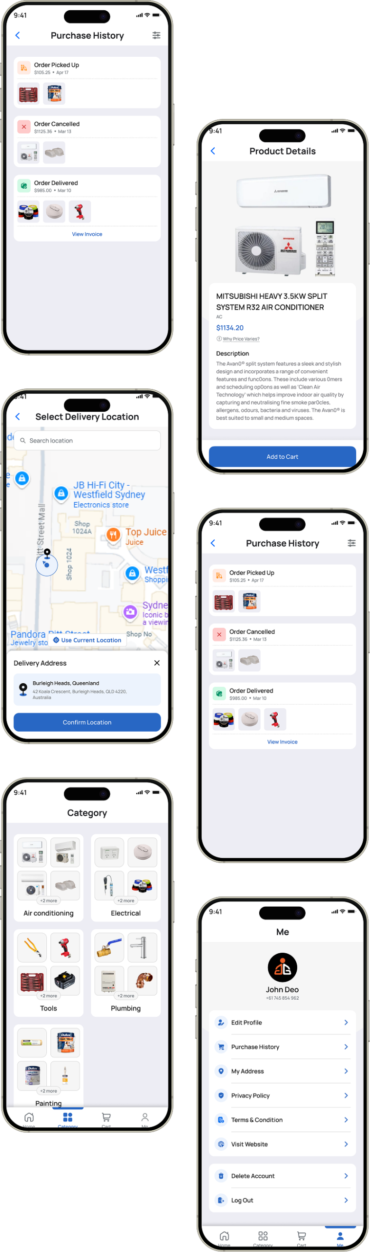
TradeRun is an on-demand commerce app designed to simplify order requests and delivery selection. The project focused on improving usability through a modern interface, clear VIP and standard delivery flows, and secure OTP verification enhancing user trust, engagement, and overall conversion performance.
The main task was to redesign TradeRun’s Application for better usability and visual appeal. We delivered a responsive & attractive layout, simplified navigation, and clear service presentation to boost engagement, increase conversions, and ensure a seamless multi-device experience.
A lightweight style guide was created to maintain visual consistency across screens, ensuring reusable components, consistent spacing, and accessible color usage.
- Typography
- Colors
- Components
- Wireframe
- Mockups
- Prototype
The design process involved understanding user pain points, mapping user flows, creating low-fidelity wireframes, and refining them into high-fidelity UI designs through iterative testing and feedback.
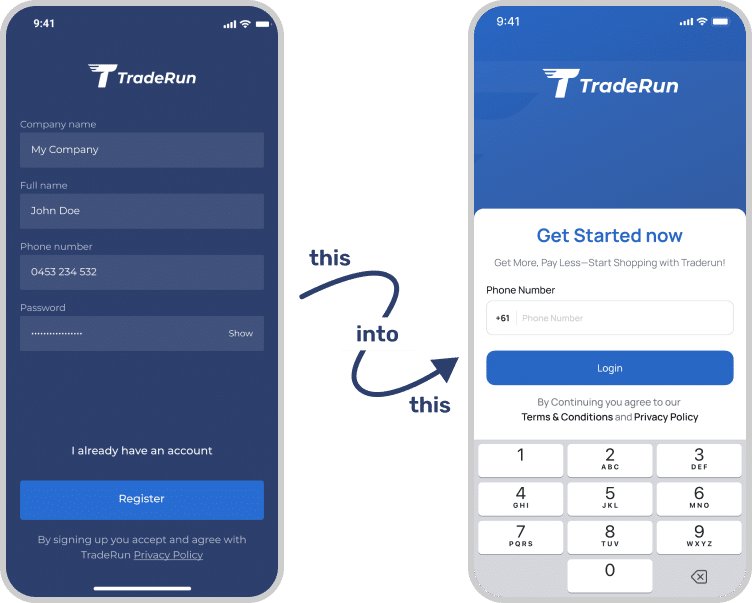
The original app suffered from unclear user flows, confusing delivery options, and poor visual hierarchy, leading to drop-offs before payment. We redesigned the experience with a clean, modern interface, simplified order flow, and clear CTAs. Improved hierarchy, mobile-first responsiveness, and structured delivery selection enhanced usability, increased engagement, and supported higher conversions.
- Unclear order flow caused confusion before payment, reducing user confidence and increasing drop-offs significantly.
- No clear distinction between VIP and Normal delivery options, leading to hesitation during order confirmation.
- Inconsistent UI components reduced usability, visual consistency, and overall trust in the app experience.
- Weak visual hierarchy made primary actions difficult to identify and slowed user decision-making.
- Lack of clarity in critical flows like verification and account actions reduced user confidence and trust.
- Poor feedback around order status left users uncertain about progress and next steps.


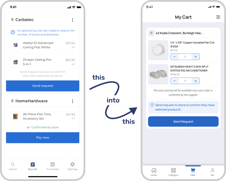
- Designed a clear, step-by-step order flow guiding users smoothly from request to payment.
- Introduced distinct VIP and Normal delivery options with progressive disclosure for faster decisions.
- Improved visual hierarchy using spacing, typography, and contrast to highlight primary actions.
- Standardized UI components to ensure consistency, usability, and stronger brand recognition throughout.
- Added clear, human-readable order status updates to improve transparency and user confidence.
- Simplified verification and account actions with clear messaging and secure OTP-based confirmation.
TradeRun’s app evolved from a cluttered, inconsistent interface into a clean, intuitive experience. Improved navigation, clearer order steps, and stronger visual hierarchy streamlined decision-making, boosted user confidence, increased conversions, and reinforced trust in the platform.
Our primary goal was to improve TradeRun’s app experience by creating a modern, user-friendly interface that increases engagement and conversion. The challenges included simplifying the order flow, clarifying delivery options, improving navigation, maintaining visual consistency, and building user trust through secure, seamless interactions.
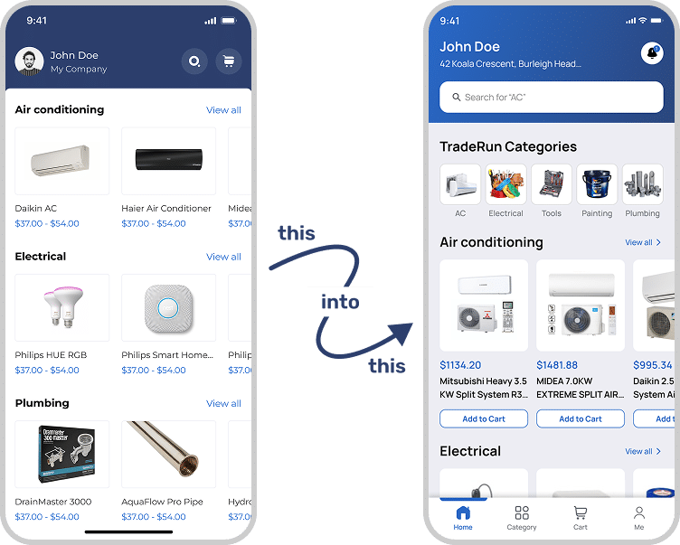
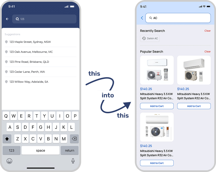
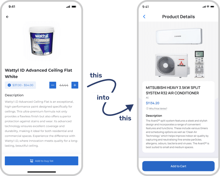
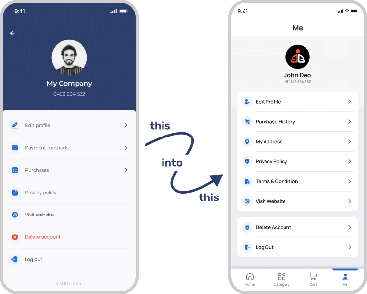
This comparison highlights the key differences between the previous and redesigned TradeRun app. The experience evolved from a cluttered and unclear flow to a clean, modern interface with simplified order steps, clear delivery options, and improved performance—enhancing usability, increasing engagement, and building user trust.
| Key Points | Old Application | New Application |
|---|---|---|
| User Interface Design | Generic, inconsistent UI with outdated components and weak brand identity. | Modern, brand-aligned interface using consistent components and clean visuals. |
| User Experience Flow | Confusing order flow with unclear steps causing hesitation and drop-offs. | Streamlined flow guiding users smoothly from order request to payment. |
| Mobile Responsiveness | Poorly optimized mobile experience with slow loading and layout issues. | Fully responsive, fast-loading, mobile-first design across all devices. |
| Visual Hierarchy | Weak hierarchy made CTAs difficult to notice and actions unclear. | Clear visual hierarchy with well-placed CTAs and balanced layout. |
| Moules | Unclear order statuses with minimal feedback on order progress. | Clear, human-readable order statuses improving transparency and user confidence. |